As a Motion Designer your field of work tends to be quite broad. I always took an huge interest in interaction design. I`m fascinated by the new layer it adds to the challenge of creating a unique design. Design of course is always user-oriented. Still I have to create something that can easily be decoded by anyone and be unique at the same time. In the Shift-project I saw the opportunity to try to live up to that challenge. Furthermore it was clear from the beginning that the whole team (especially Marcel) took an huge interest in creating a whole Shift CD (Corporate Identity) package.
But first things first. To create a consistent look we wanted to make sure to start at the core of a coporate Identity, the logo. There is a myth out there that logos are done quickly. All I can say is, don’t believe in fairy tales!
Looking at a logo – it might look like a tiny thing that can be finished in a few days.. drawing an simple apple that someone took a bite from, easy! First, creating a minimalist design often proofs to be much harder that bombastic ones. But let´s pause a second for what a single logo should be able to do, it should represent the idea in an abstract way. It should represent the philosophy and feeling of the project. Not so easy to press all these fancy words in just one logo. But when it is done you kind of feel like having given birth to something new, something amazing.
Designing the Shift logo
When I started to think about the logo for Shift, I had just finished reading Paul Ekmans Unmasking the Face: A Guide to Recognizing Emotions from Facial Expressions. In his book Ekman often states that with each facial expression – no matter how focused we are – there is one layer that we are aware of showing to our environment and one that is hidden beneath but can be detected by some people with kind of “special powers”. Most of the time it is only visible for a millisecond, but it´s still there.
![]()
![]()
![]()
![]()
some early sketches for the logo
The story of Shift for me had a similar core idea. The astral world is a world where emotions come to life, making them visible for those who possess special powers. For the logo I wanted to visualize this idea. I definitely wanted to include psychology into my concept. This made me think about the Rorschach test often referred as inkblot-test. In that test the personality of a patient is released simply by showing him ten inkblot, and letting him tell you what he sees. He projects his emotions onto the inkblots, making them “visible” for his environment.
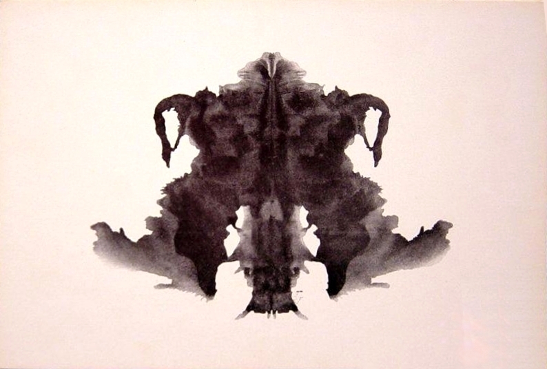
And this turned out to be the core concept behind the logo. Next to the psychological part, I also wanted to make sure to display the two layers of the Shift-world. The human side on the one hand and the astral-layer on the other, reaching out for each other, overlapping and together creating the universe of Shift.


Rohrschach logo sketches, getting closer .. but the outlines are just not right.
But as it is a logo for a comic after all Marcel wanted to make sure that it had a kind of icon/symbol style and that it could be reproduced by fans. We also wanted to make sure that it had a recognizable shape. So we decided to lose some of the details and shift it to a more minimalistic style.
![]()
![]()
![]()
And after a lot of time of fine-tuning (I felt like I tried every combination of colours possible) we finally created a logo that somehow combined the whole philosophy of Shift.
![]()
Looking at it again and again I tend to find new associations for Shift that I originally never intended to create. Throughout its abstract shape it somehow develops/evolves itself by reflecting the emotions and ideas of the audience.
 Iris Schwarz – Motion Designer